 Revela
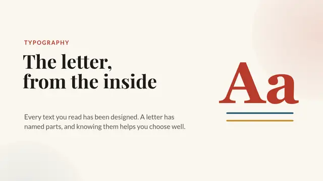
Typography: anatomy of a letter
Looking at letters up close: serif and sans serif, x-height, stems, terminals and counters, letter-spacing and size, how to choose two typefaces that go well together and an exercise with the classroom poster.
- 11 slides
- Free, nothing to install
- Downloads as PowerPoint
What’s inside
How to use it
- Click Use this template: it opens in Revela, in your browser. Nothing to install.
- Replace the text, images and data with your own. The speaker notes tell you what to say on each slide.
- Present it with your phone as a remote, share it with a link or download it as PowerPoint.
More in Creative styles
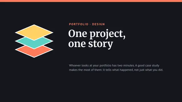 Portfolio: a case studyHow to tell the story of a design project in a portfolio: the challenge, the research, the process with its tests, the result with figures and what was learned, with a structure anyone can copy
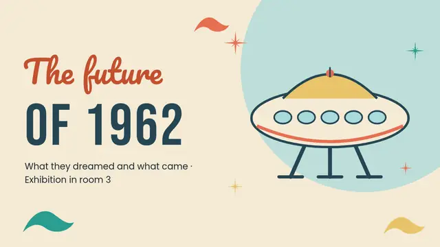 Retrofuturism: the future of 1962Atomic age: a morphing saucer house, chained hits and misses, walking 3D robot, radar, matrix, countdown and word cloud
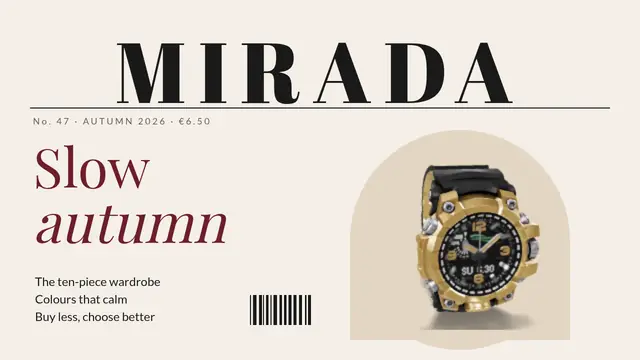 Fashion magazine: slow autumnMagazine style: serif masthead, a 3D watch on the cover, columns with a drop cap, a big quote, the season's palette and a chart
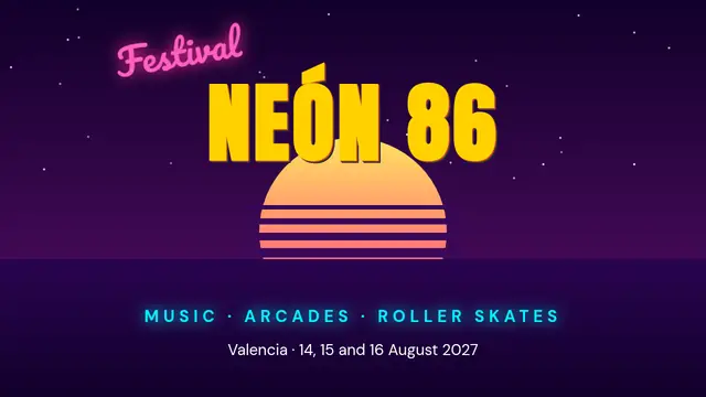 Synthwave: Neón 86 festivalRetro 80s style: gradient sun, a grid that draws itself, glowing neon, Morph, a dancing 3D robot and a word cloud
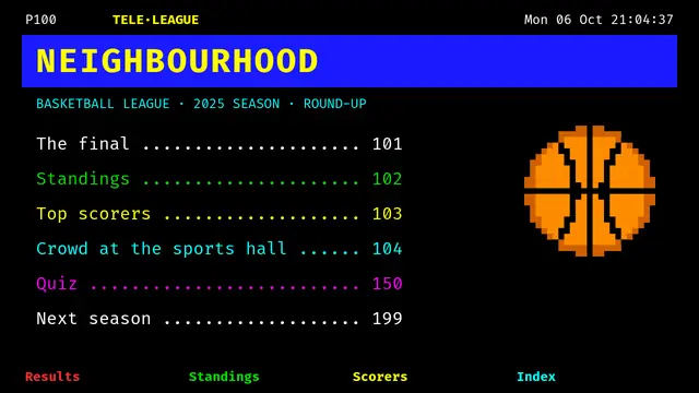 Teletext: the neighbourhood leagueTeletext pages: lines that load by themselves, scoreboard and standings with formulas, bars, columns, quiz and countdown
 Vaporwave: the music in shopsPastel vaporwave: a morphing moon, SVG palm trees, glitch titles, scatter, 3D lamp, table with average and rating